Matplotlib의 여러가지 플롯#
Matplotlib는 기본적인 라인 플롯 이외에도 다양한 챠트/플롯 유형을 지원한다.
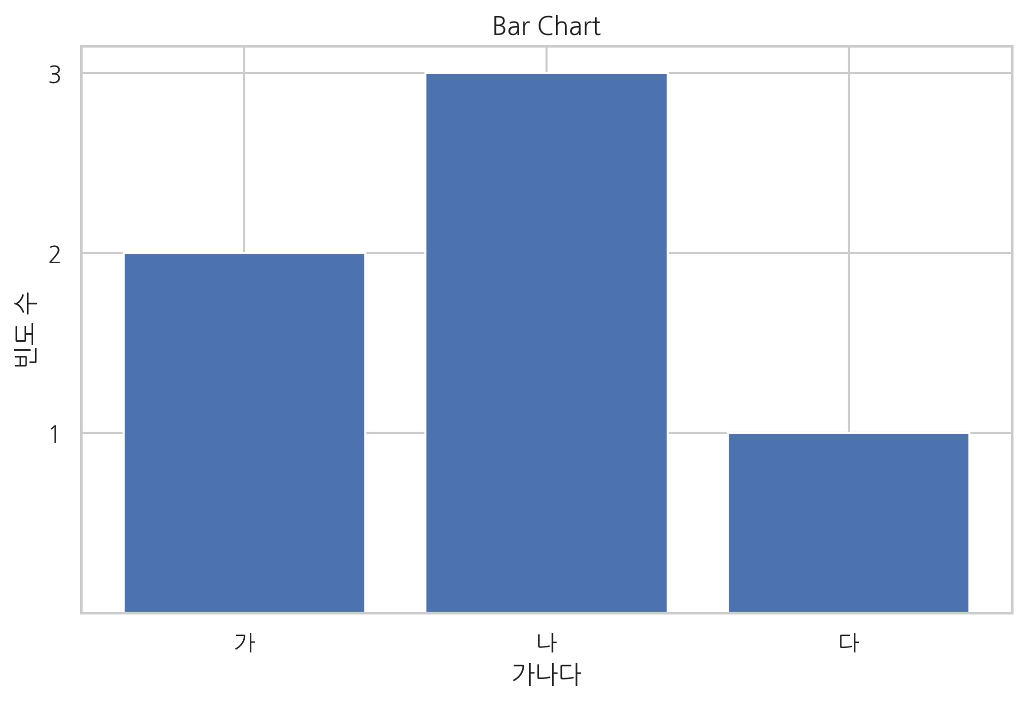
바 차트#
x 데이터가 카테고리 값인 경우에는 bar 명령과 barh 명령으로 바 차트(bar chart) 시각화를 할 수 있다. 가로 방향으로 바 차트를 그리려면 barh 명령을 사용한다.
자세한 내용은 다음 웹사이트를 참조한다.
http://matplotlib.org/api/pyplot_api.html#matplotlib.pyplot.bar
http://matplotlib.org/api/pyplot_api.html#matplotlib.pyplot.barh
바 차트 작성시 주의점은 첫번째 인수인 left 가 x축에서 바(bar)의 왼쪽 변의 위치를 나타낸다는 점이다.
import matplotlib as mpl
import matplotlib.pylab as plt

y = [2, 3, 1]
x = np.arange(len(y))
xlabel = ['가', '나', '다']
plt.title("Bar Chart")
plt.bar(x, y)
plt.xticks(x, xlabel)
plt.yticks(sorted(y))
plt.xlabel("가나다")
plt.ylabel("빈도 수")
plt.show()
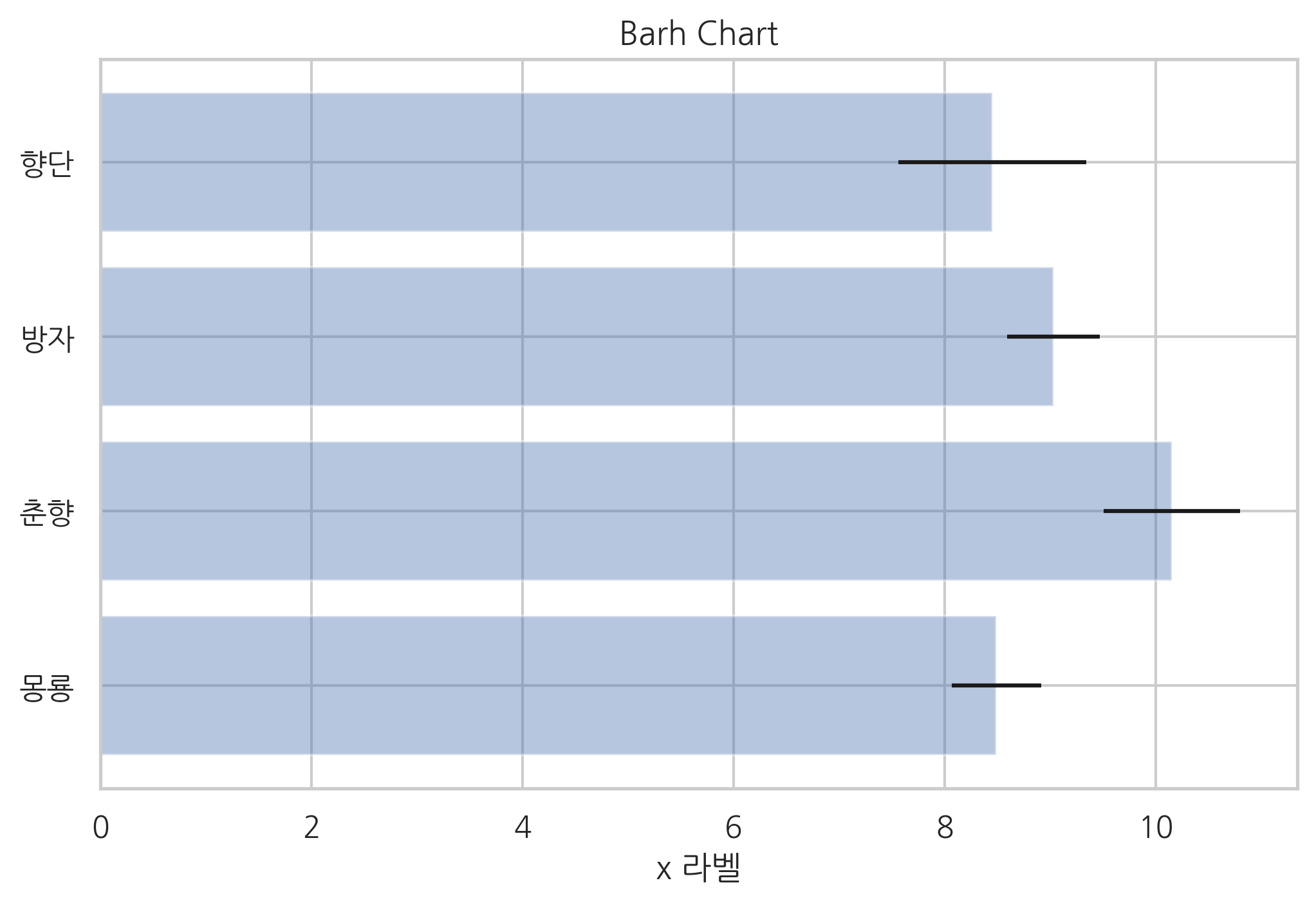
xerr 인수나 yerr 인수를 지정하면 에러 바(error bar)를 추가할 수 있다.
다음 코드에서 alpha는 투명도를 지정한다. 0이면 완전 투명, 1이면 완전 불투명이다.
np.random.seed(0)

people = ['몽룡', '춘향', '방자', '향단']
y_pos = np.arange(len(people))
performance = 3 + 10 * np.random.rand(len(people))
error = np.random.rand(len(people))

plt.title("Barh Chart")
plt.barh(y_pos, performance, xerr=error, alpha=0.4)
plt.yticks(y_pos, people)
plt.xlabel('x 라벨')
plt.show()
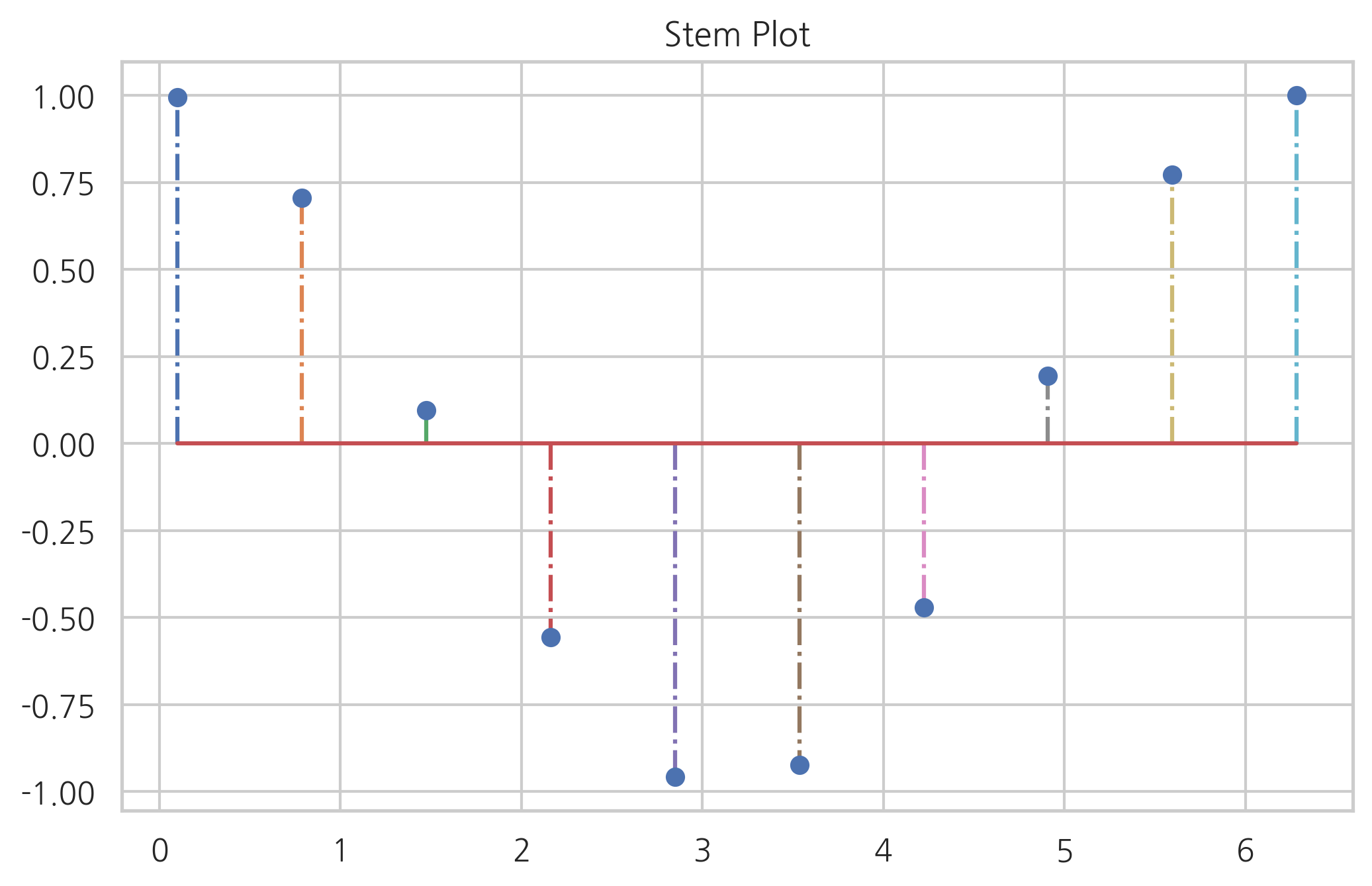
스템 플롯#
바 차트와 유사하지만 폭(width)이 없는 스템 플롯(stem plot)도 있다. 주로 이산 확률 함수나 자기상관관계(auto-correlation)를 묘사할 때 사용된다.
x = np.linspace(0.1, 2 * np.pi, 10)
plt.title("Stem Plot")
plt.stem(x, np.cos(x), '-.')
plt.show()
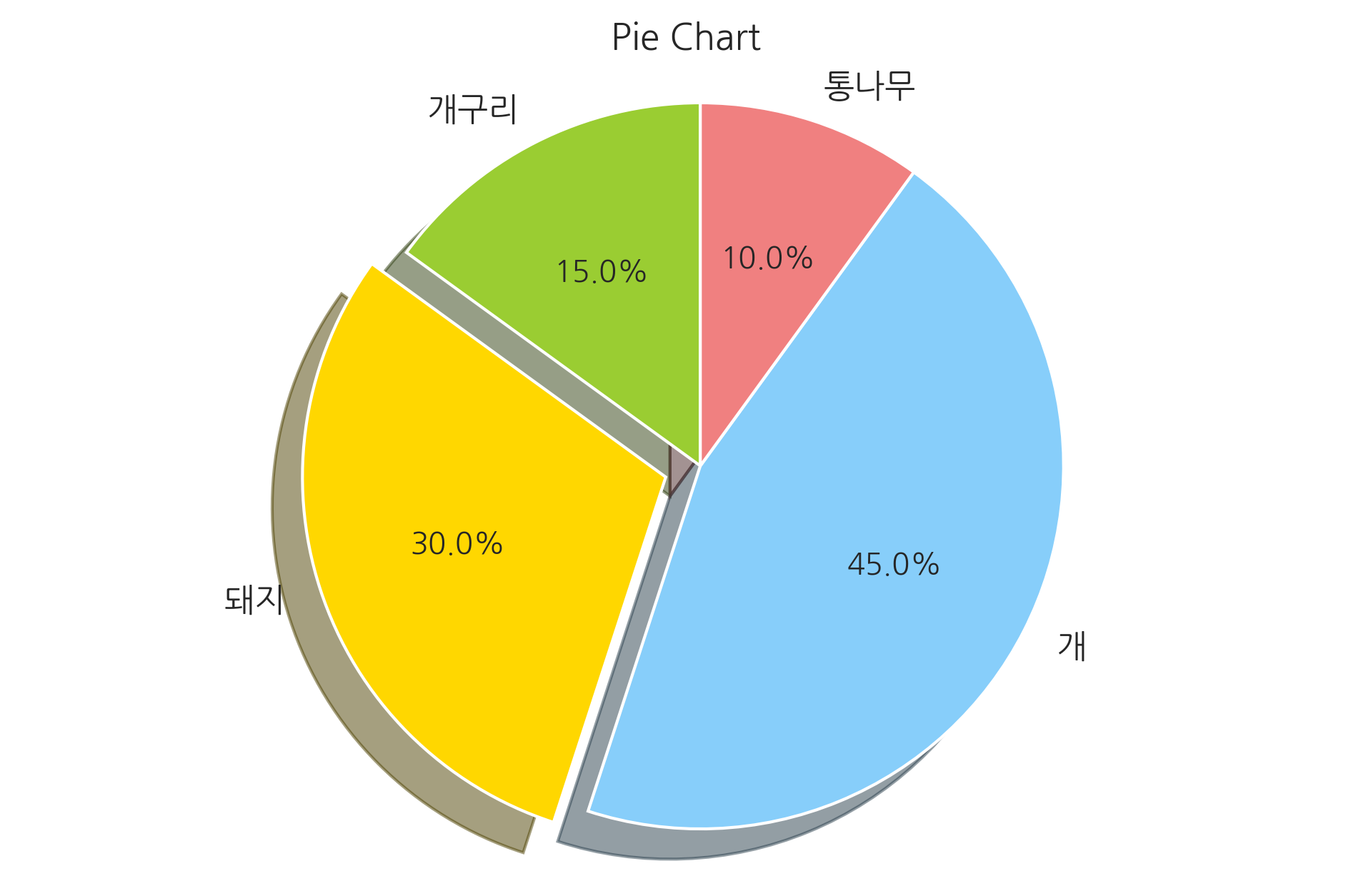
파이 차트#
카테고리 별 값의 상대적인 비교를 해야 할 때는 pie 명령으로 파이 차트(pie chart)를 그릴 수 있다. 파이 차트를 그릴 때는 윈의 형태를 유지할 수 있도록 다음 명령을 실행해야 한다.
plt.axis('equal')
자세한 내용은 다음을 참조한다.
labels = ['개구리', '돼지', '개', '통나무']
sizes = [15, 30, 45, 10]
colors = ['yellowgreen', 'gold', 'lightskyblue', 'lightcoral']
explode = (0, 0.1, 0, 0)
plt.title("Pie Chart")
plt.pie(sizes, explode=explode, labels=labels, colors=colors,
        autopct='%1.1f%%', shadow=True, startangle=90)
plt.axis('equal')
plt.show()
히스토그램#
히스토그램을 그리기 위한 hist 명령도 있다. hist 명령은 bins 인수로 데이터를 집계할 구간 정보를 받는다. 반환값으로 데이터 집계 결과를 반환한다.
np.random.seed(0)
x = np.random.randn(1000)
plt.title("Histogram")
arrays, bins, patches = plt.hist(x, bins=10)
plt.show()
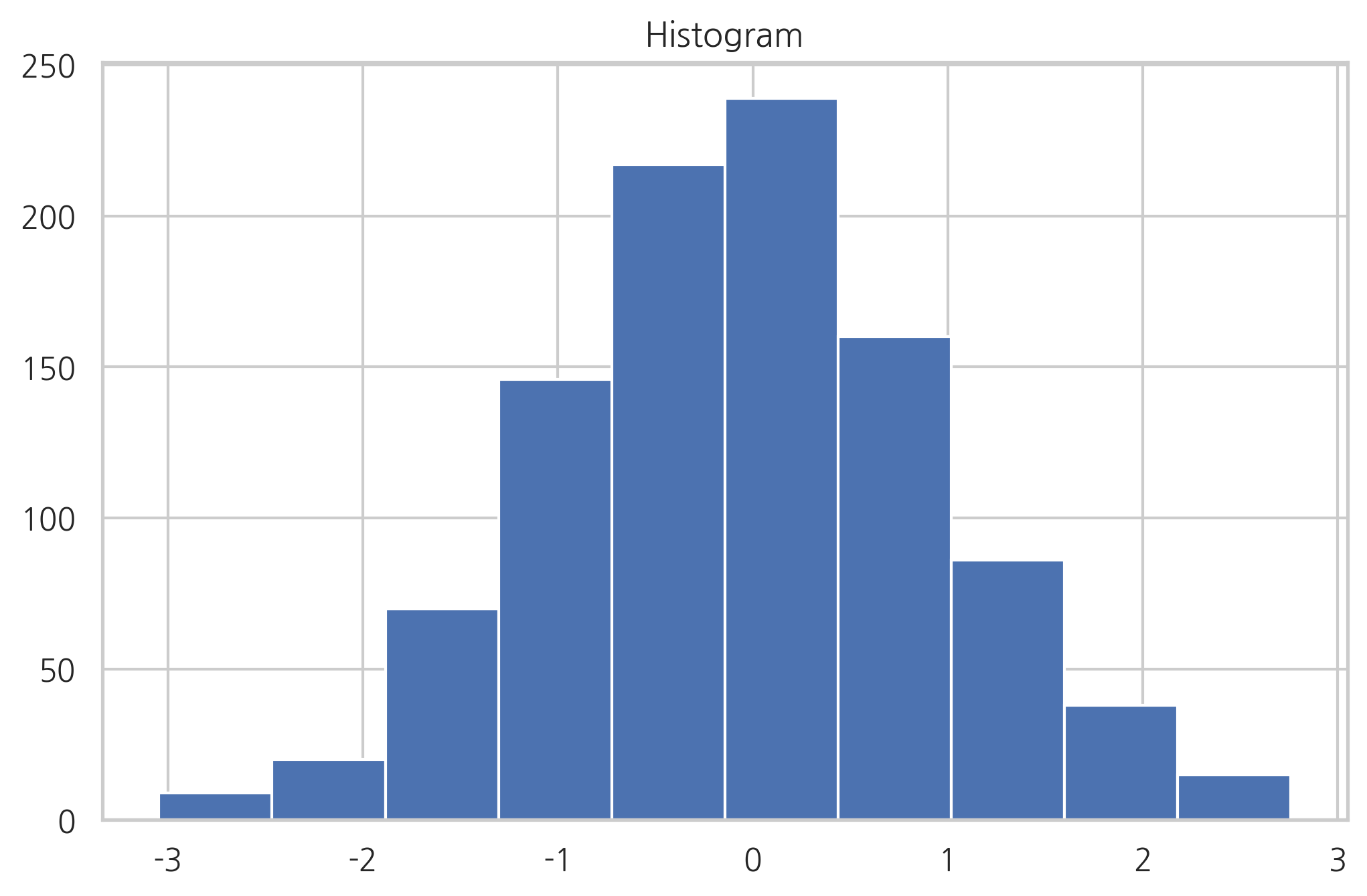
arrays
array([ 9., 20., 70., 146., 217., 239., 160., 86., 38., 15.])
bins
array([-3.04614305, -2.46559324, -1.88504342, -1.3044936 , -0.72394379,
       -0.14339397,  0.43715585,  1.01770566,  1.59825548,  2.1788053 ,
        2.75935511])
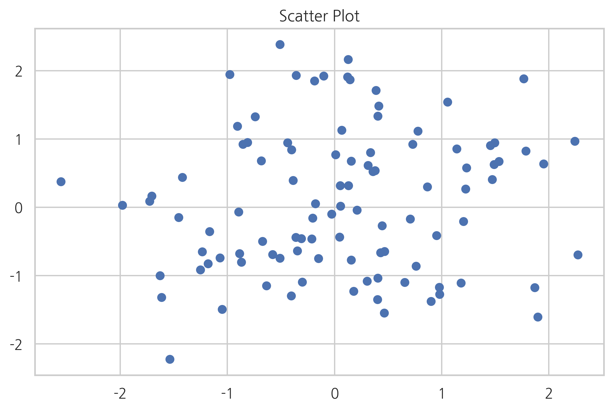
스캐터 플롯#
2차원 데이터 즉, 두 개의 실수 데이터 집합의 상관관계를 살펴보려면 scatter 명령으로 스캐터 플롯을 그린다. 스캐터 플롯의 점 하나의 위치는 데이터 하나의 x, y 값이다.
np.random.seed(0)
X = np.random.normal(0, 1, 100)
Y = np.random.normal(0, 1, 100)
plt.title("Scatter Plot")
plt.scatter(X, Y)
plt.show()
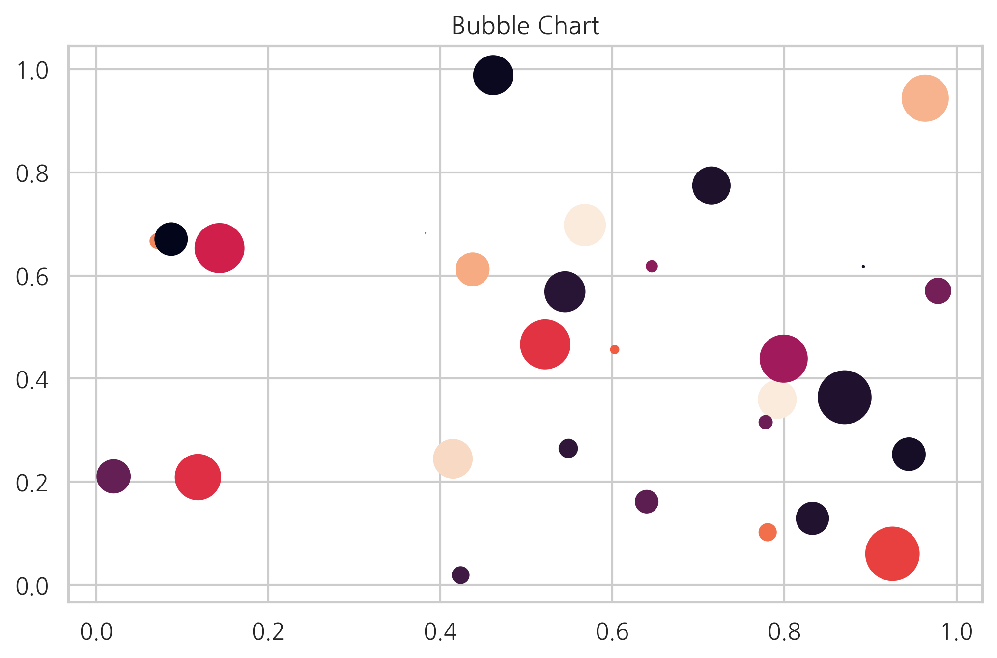
데이터가 2차원이 아니라 3차원 혹은 4차원인 경우에는 점 하나의 크기 혹은 색깔을 이용하여 다른 데이터 값을 나타낼 수도 있다. 이런 차트를 버블 차트(bubble chart)라고 한다. 크기는 s 인수로 색깔은 c 인수로 지정한다.
N = 30
np.random.seed(0)
x = np.random.rand(N)
y1 = np.random.rand(N)
y2 = np.random.rand(N)
y3 = np.pi * (15 * np.random.rand(N))**2
plt.title("Bubble Chart")
plt.scatter(x, y1, c=y2, s=y3)
plt.show()
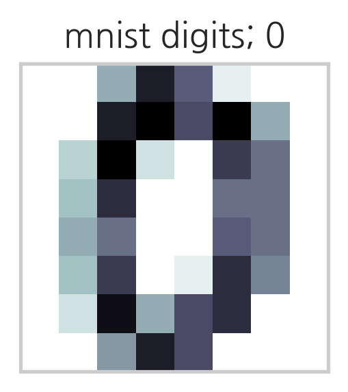
Imshow#
화상(image) 데이터처럼 행과 열을 가진 행렬 형태의 2차원 데이터는 imshow 명령을 써서 2차원 자료의 크기를 색깔로 표시하는 것이다.
from sklearn.datasets import load_digits
digits = load_digits()
X = digits.images[0]
X
array([[ 0.,  0.,  5., 13.,  9.,  1.,  0.,  0.],
       [ 0.,  0., 13., 15., 10., 15.,  5.,  0.],
       [ 0.,  3., 15.,  2.,  0., 11.,  8.,  0.],
       [ 0.,  4., 12.,  0.,  0.,  8.,  8.,  0.],
       [ 0.,  5.,  8.,  0.,  0.,  9.,  8.,  0.],
       [ 0.,  4., 11.,  0.,  1., 12.,  7.,  0.],
       [ 0.,  2., 14.,  5., 10., 12.,  0.,  0.],
       [ 0.,  0.,  6., 13., 10.,  0.,  0.,  0.]])
plt.title("mnist digits; 0")
plt.imshow(X, interpolation='nearest', cmap=plt.cm.bone_r)
plt.xticks([])
plt.yticks([])
plt.grid(False)
plt.subplots_adjust(left=0.35, right=0.65, bottom=0.35, top=0.65)
plt.show()
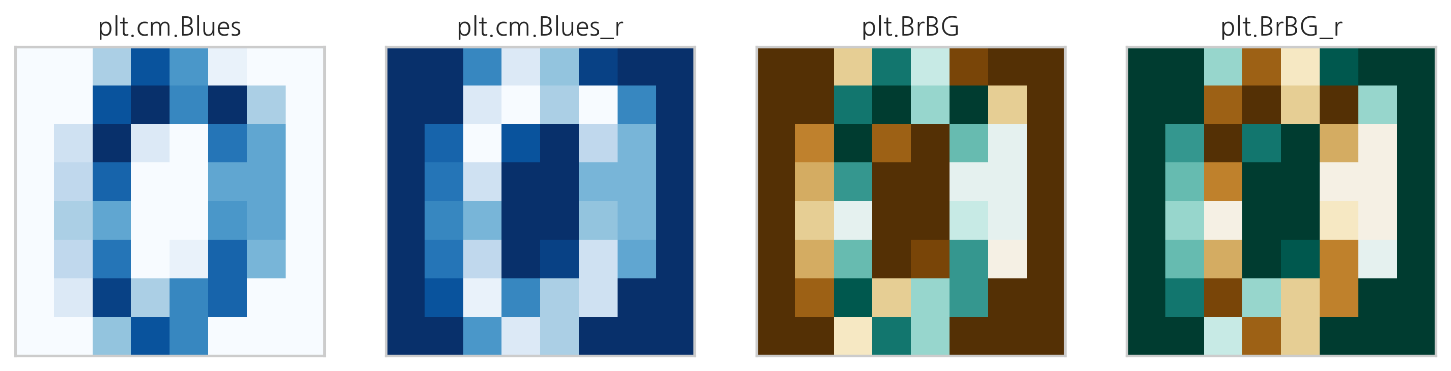
데이터 수치를 색으로 바꾸는 함수는 칼라맵(color map)이라고 한다. 칼라맵은 cmap 인수로 지정한다. 사용할 수 있는 칼라맵은 plt.cm의 속성으로 포함되어 있다. 아래에 일부 칼라맵을 표시하였다. 칼라맵은 문자열로 지정해도 된다. 칼라맵에 대한 자세한 내용은 다음 웹사이트를 참조한다.
dir(plt.cm)[:10]
['Accent',
 'Accent_r',
 'Blues',
 'Blues_r',
 'BrBG',
 'BrBG_r',
 'BuGn',
 'BuGn_r',
 'BuPu',
 'BuPu_r']
fig, axes = plt.subplots(1, 4, figsize=(12, 3),
                         subplot_kw={'xticks': [], 'yticks': []})
axes[0].set_title("plt.cm.Blues")
axes[0].imshow(X, interpolation='nearest', cmap=plt.cm.Blues)
axes[1].set_title("plt.cm.Blues_r")
axes[1].imshow(X, interpolation='nearest', cmap=plt.cm.Blues_r)
axes[2].set_title("plt.BrBG")
axes[2].imshow(X, interpolation='nearest', cmap='BrBG')
axes[3].set_title("plt.BrBG_r")
axes[3].imshow(X, interpolation='nearest', cmap='BrBG_r')
plt.show()
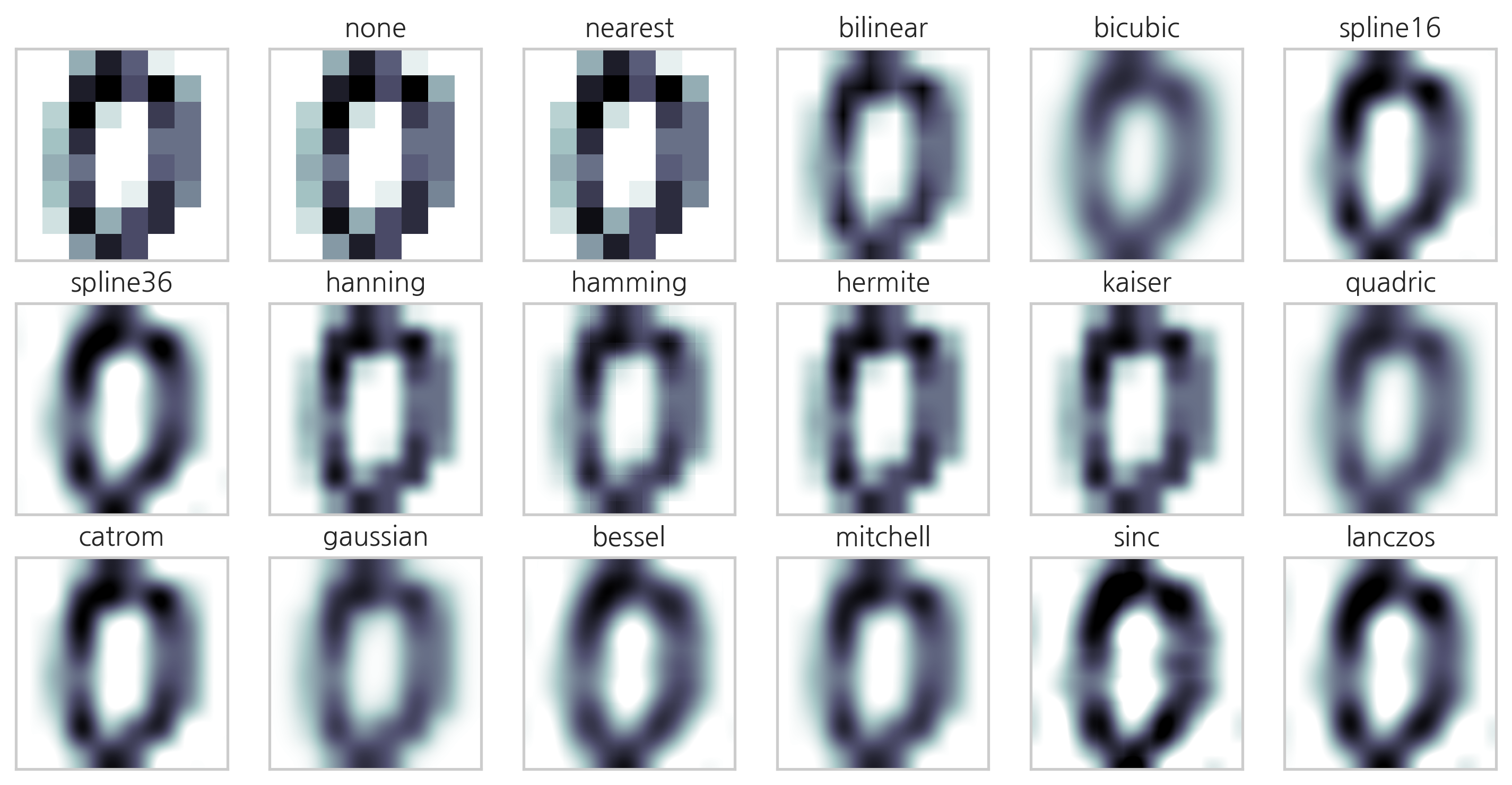
imshow 명령은 자료의 시각화를 돕기위해 다양한 2차원 인터폴레이션을 지원한다.
methods = [
    None, 'none', 'nearest', 'bilinear', 'bicubic', 'spline16',
    'spline36', 'hanning', 'hamming', 'hermite', 'kaiser', 'quadric',
    'catrom', 'gaussian', 'bessel', 'mitchell', 'sinc', 'lanczos'
]
fig, axes = plt.subplots(3, 6, figsize=(12, 6),
                         subplot_kw={'xticks': [], 'yticks': []})
for ax, interp_method in zip(axes.flat, methods):
    ax.imshow(X, cmap=plt.cm.bone_r, interpolation=interp_method)
    ax.set_title(interp_method)
plt.show()
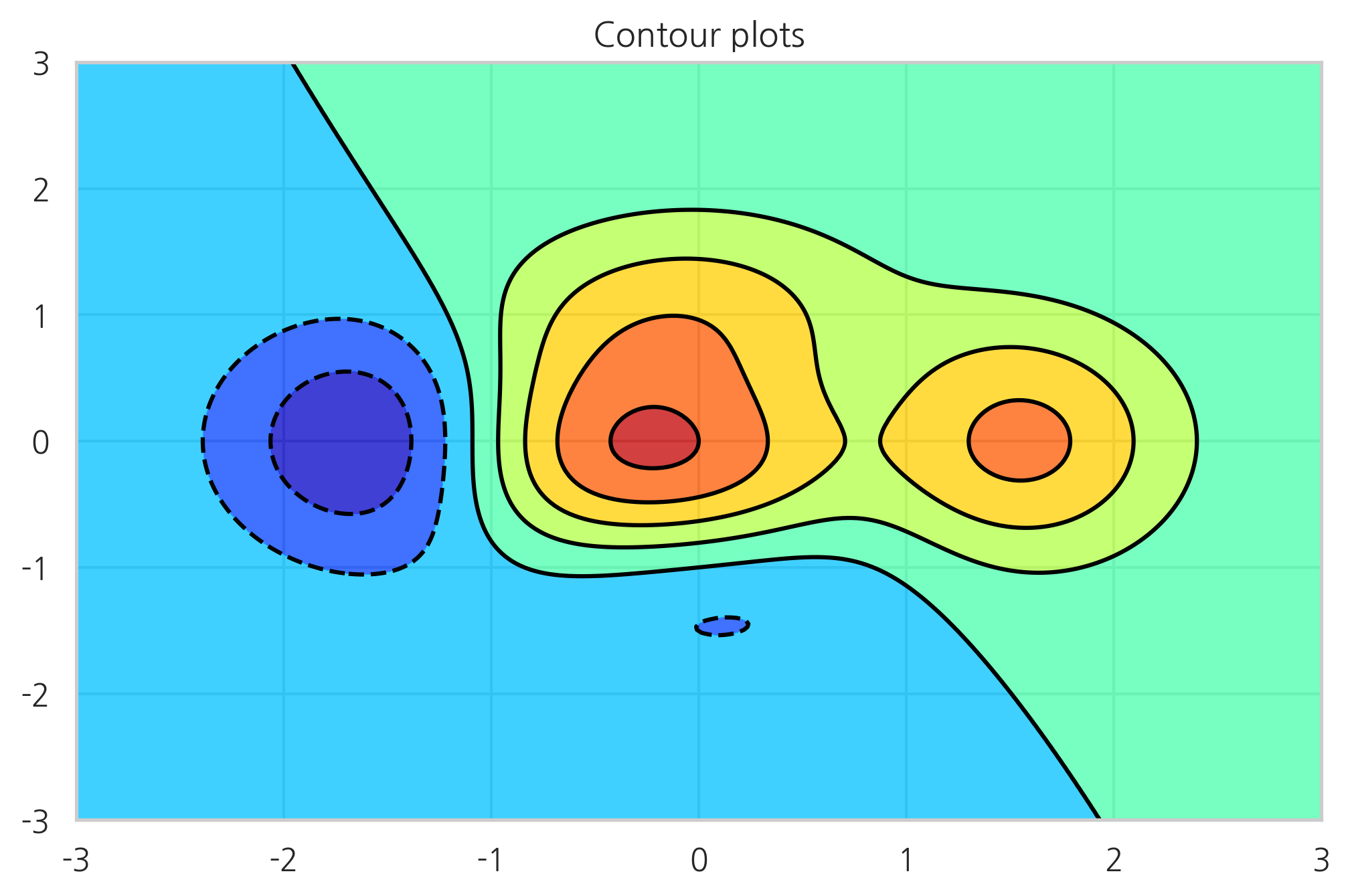
컨투어 플롯#
입력 변수가 x, y 두 개이고 출력 변수가 z 하나인 경우에는 3차원 자료가 된다. 3차원 자료를 시각화하는 방법은 명암이 아닌 등고선(contour)을 사용하는 방법이다. contour 혹은 contourf 명령을 사용한다. contour는 등고선만 표시하고 contourf는 색깔로 표시한다. 입력 변수 x, y는 그대로 사용할 수 없고 meshgrid 명령으로 그리드 포인트 행렬을 만들어야 한다. 더 자세한 내용은 다음 웹사이트를 참조한다.
http://matplotlib.org/api/pyplot_api.html#matplotlib.pyplot.contour
http://matplotlib.org/api/pyplot_api.html#matplotlib.pyplot.contourf
def f(x, y):
    return (1 - x / 2 + x ** 5 + y ** 3) * np.exp(-x ** 2 - y ** 2)


n = 256
x = np.linspace(-3, 3, n)
y = np.linspace(-3, 3, n)
XX, YY = np.meshgrid(x, y)
ZZ = f(XX, YY)

plt.title("Contour plots")
plt.contourf(XX, YY, ZZ, alpha=.75, cmap='jet')
plt.contour(XX, YY, ZZ, colors='black')
plt.show()
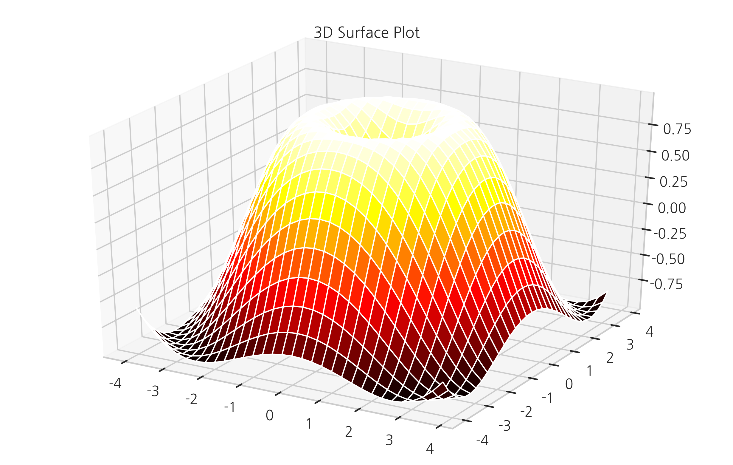
3D 서피스 플롯#
3차원 플롯은 등고선 플롯과 달리 Axes3D라는 3차원 전용 axes를 생성하여 입체적으로 표시한다.
plot_wireframe, plot_surface 명령을 사용한다.
from mpl_toolkits.mplot3d import Axes3D
X = np.arange(-4, 4, 0.25)
Y = np.arange(-4, 4, 0.25)
XX, YY = np.meshgrid(X, Y)
RR = np.sqrt(XX**2 + YY**2)
ZZ = np.sin(RR)

fig = plt.figure()
ax = Axes3D(fig)
ax.set_title("3D Surface Plot")
ax.plot_surface(XX, YY, ZZ, rstride=1, cstride=1, cmap='hot')
plt.show()