Pandas의 시각화 기능#
Pandas의 시리즈나 데이터프레임은 plot이라는 시각화 메서드를 내장하고 있다. plot은 matplotlib를 내부에서 임포트하여 사용한다.
np.random.seed(0)
df1 = pd.DataFrame(np.random.randn(100, 3),
                   index=pd.date_range('1/1/2018', periods=100),
                   columns=['A', 'B', 'C']).cumsum()
df1.tail()
| A | B | C | |
|---|---|---|---|
| 2018-04-06 | 9.396256 | 6.282026 | -11.198087 |
| 2018-04-07 | 10.086074 | 7.583872 | -11.826175 |
| 2018-04-08 | 9.605047 | 9.887789 | -12.886190 |
| 2018-04-09 | 9.469097 | 11.024680 | -12.788465 |
| 2018-04-10 | 10.052051 | 10.625231 | -12.418409 |
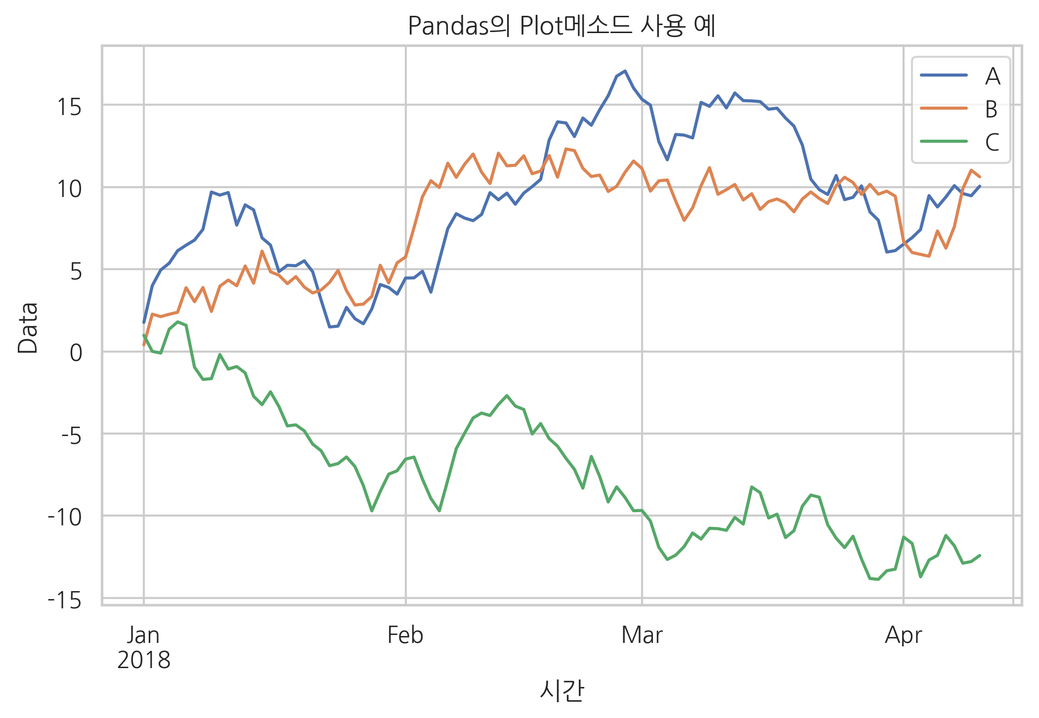
df1.plot()
plt.title("Pandas의 Plot메소드 사용 예")
plt.xlabel("시간")
plt.ylabel("Data")
plt.show()
plot 메서드의 kind라는 인수를 바꾸면 여러가지 플롯을 그릴 수 있다. 다음과 같은 인수값을 지원한다.
barpiehistkdeboxscatterarea
iris = sns.load_dataset("iris") # 붓꽃 데이터
titanic = sns.load_dataset("titanic") # 타이타닉호 데이터
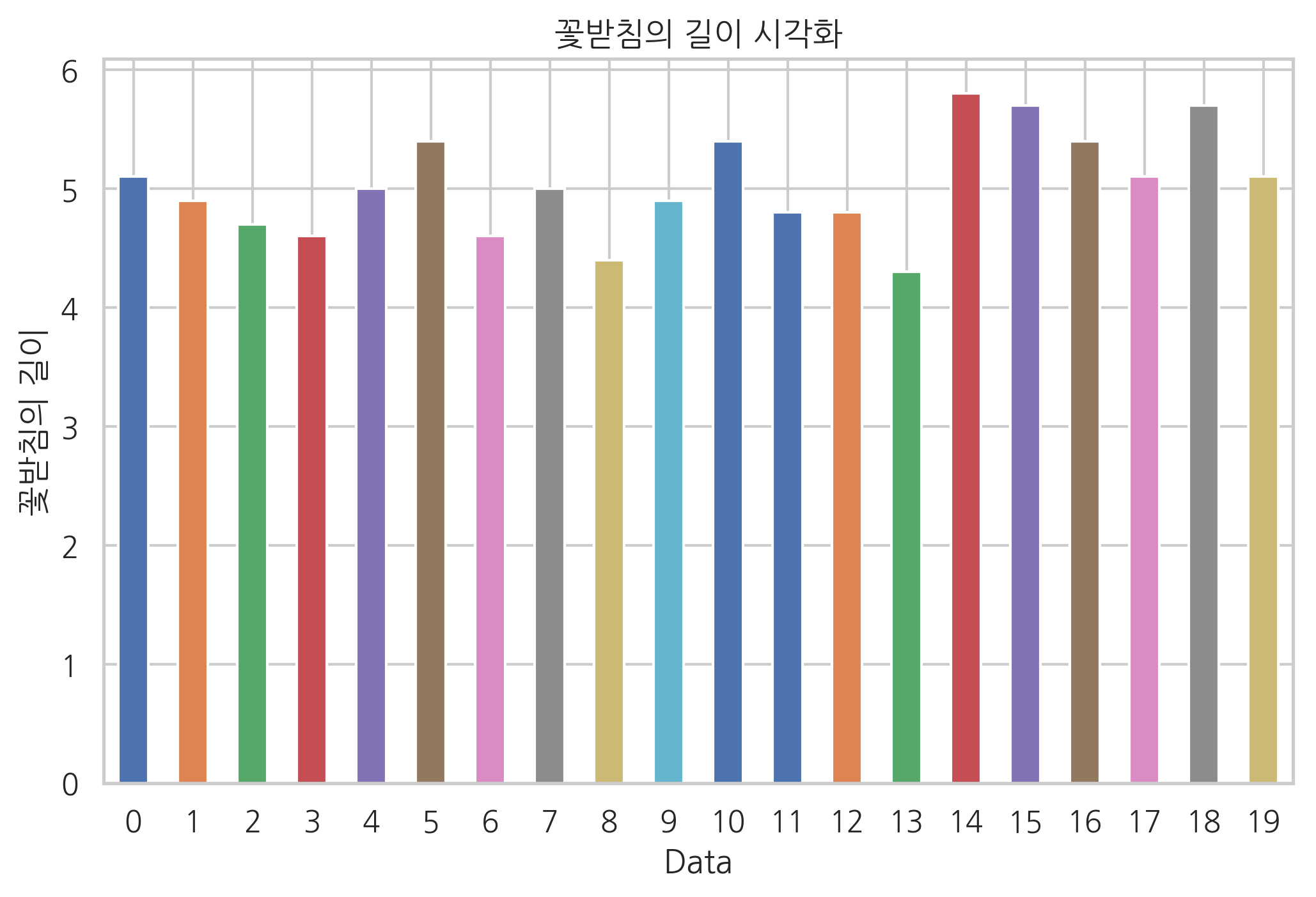
iris.sepal_length[:20].plot(kind='bar', rot=0)
plt.title("꽃받침의 길이 시각화")
plt.xlabel("Data")
plt.ylabel("꽃받침의 길이")
plt.show()
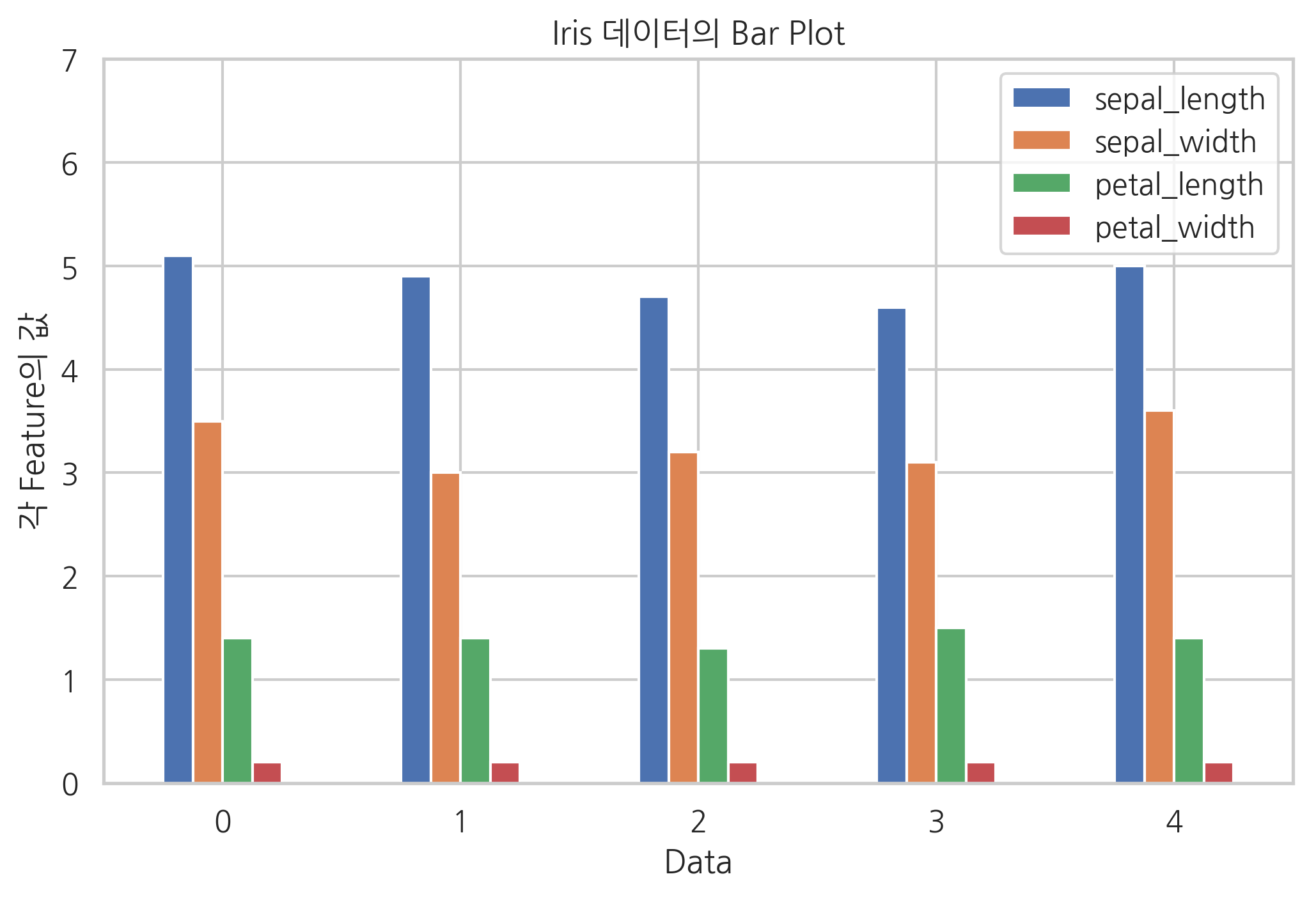
kind 인수에 문자열을 쓰는 대신 plot.bar처럼 직접 메서드로 사용할 수도 있다.
iris[:5].plot.bar(rot=0)
plt.title("Iris 데이터의 Bar Plot")
plt.xlabel("Data")
plt.ylabel("각 Feature의 값")
plt.ylim(0, 7)
plt.show()
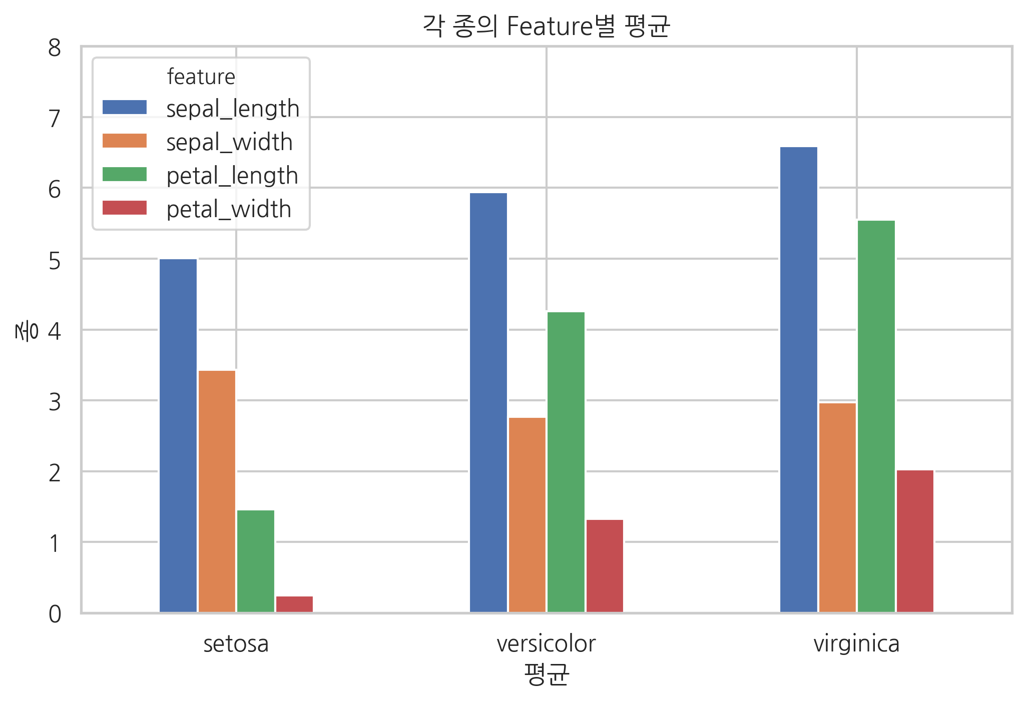
다음은 그룹분석으로 각 붓꽃종의 특징값의 평균을 구한 것이다.
df2 = iris.groupby(iris.species).mean()
df2.columns.name = "feature"
df2
| feature | sepal_length | sepal_width | petal_length | petal_width |
|---|---|---|---|---|
| species | ||||
| setosa | 5.006 | 3.428 | 1.462 | 0.246 |
| versicolor | 5.936 | 2.770 | 4.260 | 1.326 |
| virginica | 6.588 | 2.974 | 5.552 | 2.026 |
그룹분석 결과도 데이터프레임이므로 같은 방식으로 시각화할 수 있다.
df2.plot.bar(rot=0)
plt.title("각 종의 Feature별 평균")
plt.xlabel("평균")
plt.ylabel("종")
plt.ylim(0, 8)
plt.show()
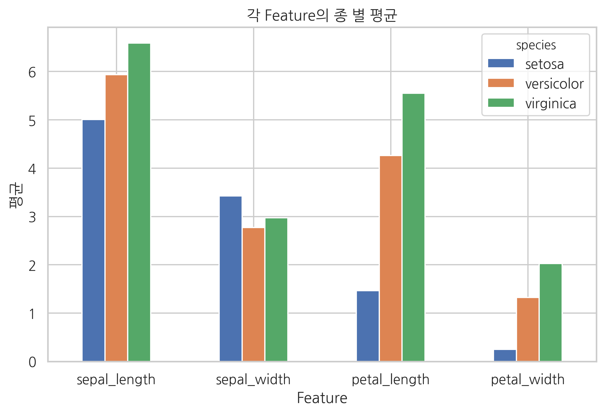
전치연산으로 시각화 방법을 다르게 할 수도 있다.
df2.T.plot.bar(rot=0)
plt.title("각 Feature의 종 별 평균")
plt.xlabel("Feature")
plt.ylabel("평균")
plt.show()
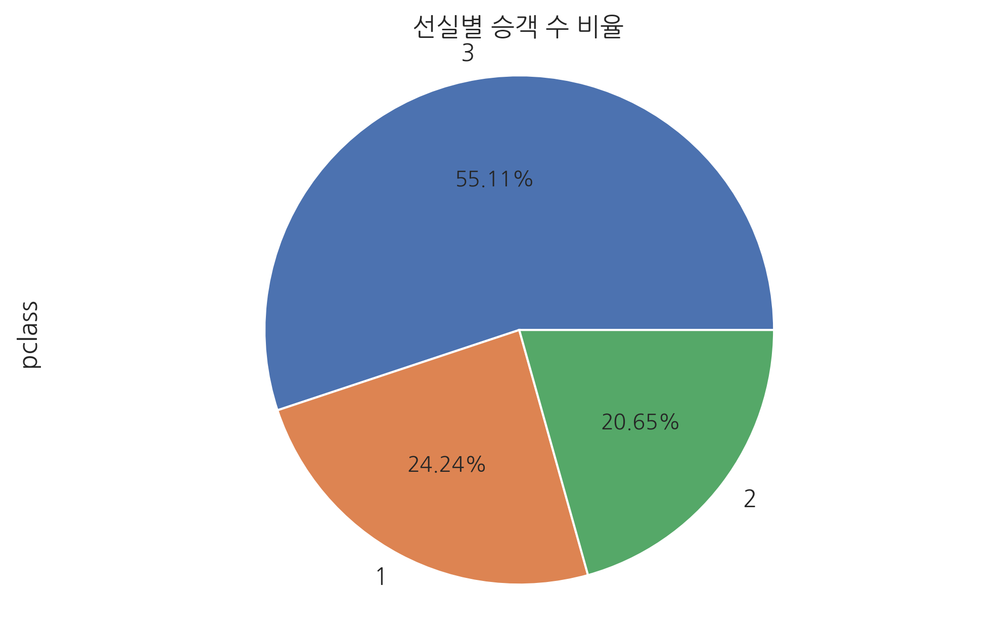
다음은 pie, hist, kde, box, scatter 플롯 예제이다.
df3 = titanic.pclass.value_counts()
df3.plot.pie(autopct='%.2f%%')
plt.title("선실별 승객 수 비율")
plt.axis('equal')
plt.show()
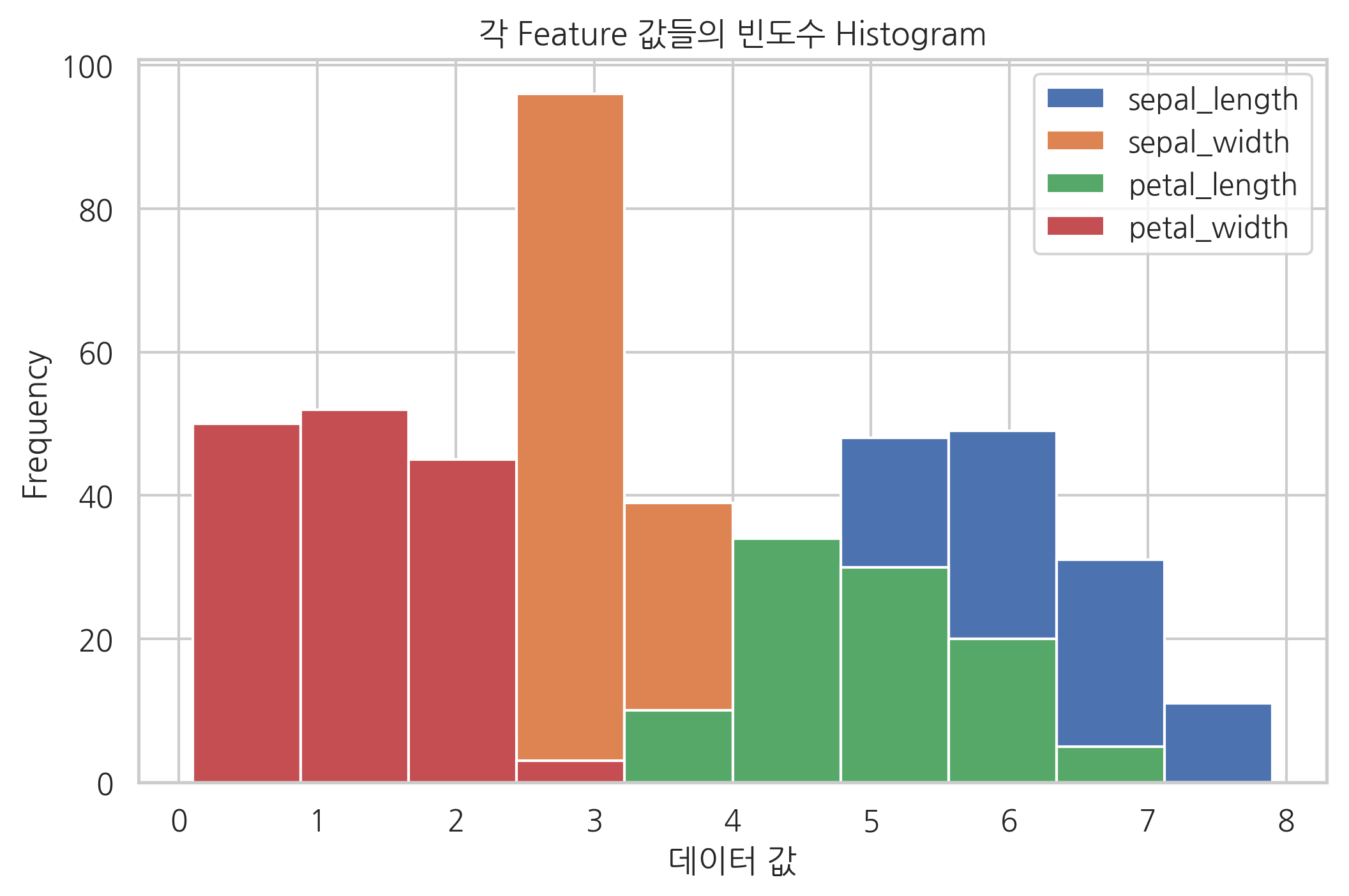
iris.plot.hist()
plt.title("각 Feature 값들의 빈도수 Histogram")
plt.xlabel("데이터 값")
plt.show()
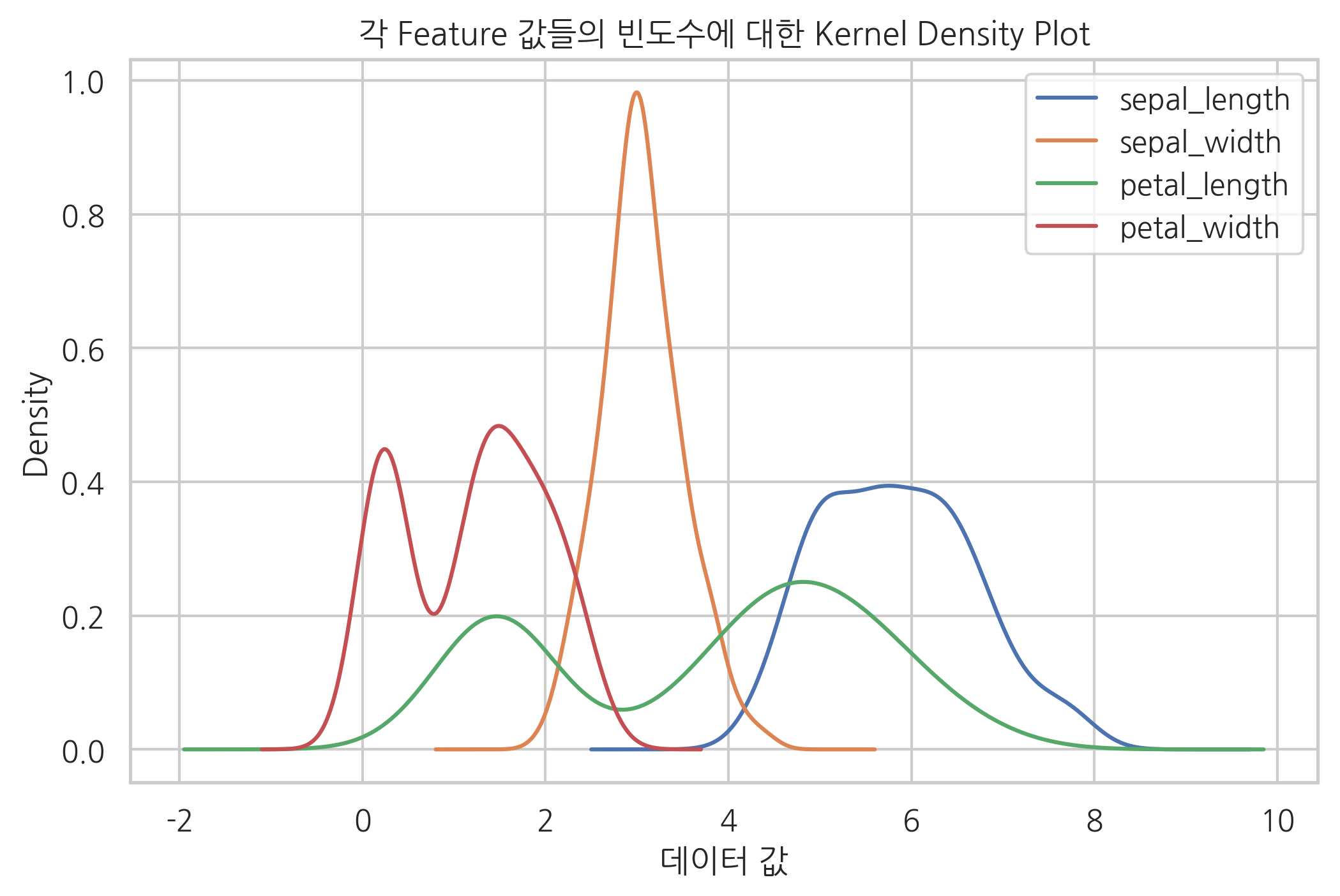
iris.plot.kde()
plt.title("각 Feature 값들의 빈도수에 대한 Kernel Density Plot")
plt.xlabel("데이터 값")
plt.show()
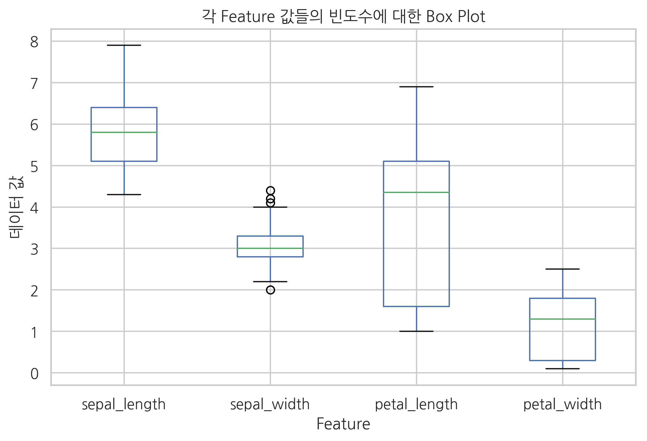
iris.plot.box()
plt.title("각 Feature 값들의 빈도수에 대한 Box Plot")
plt.xlabel("Feature")
plt.ylabel("데이터 값")
plt.show()
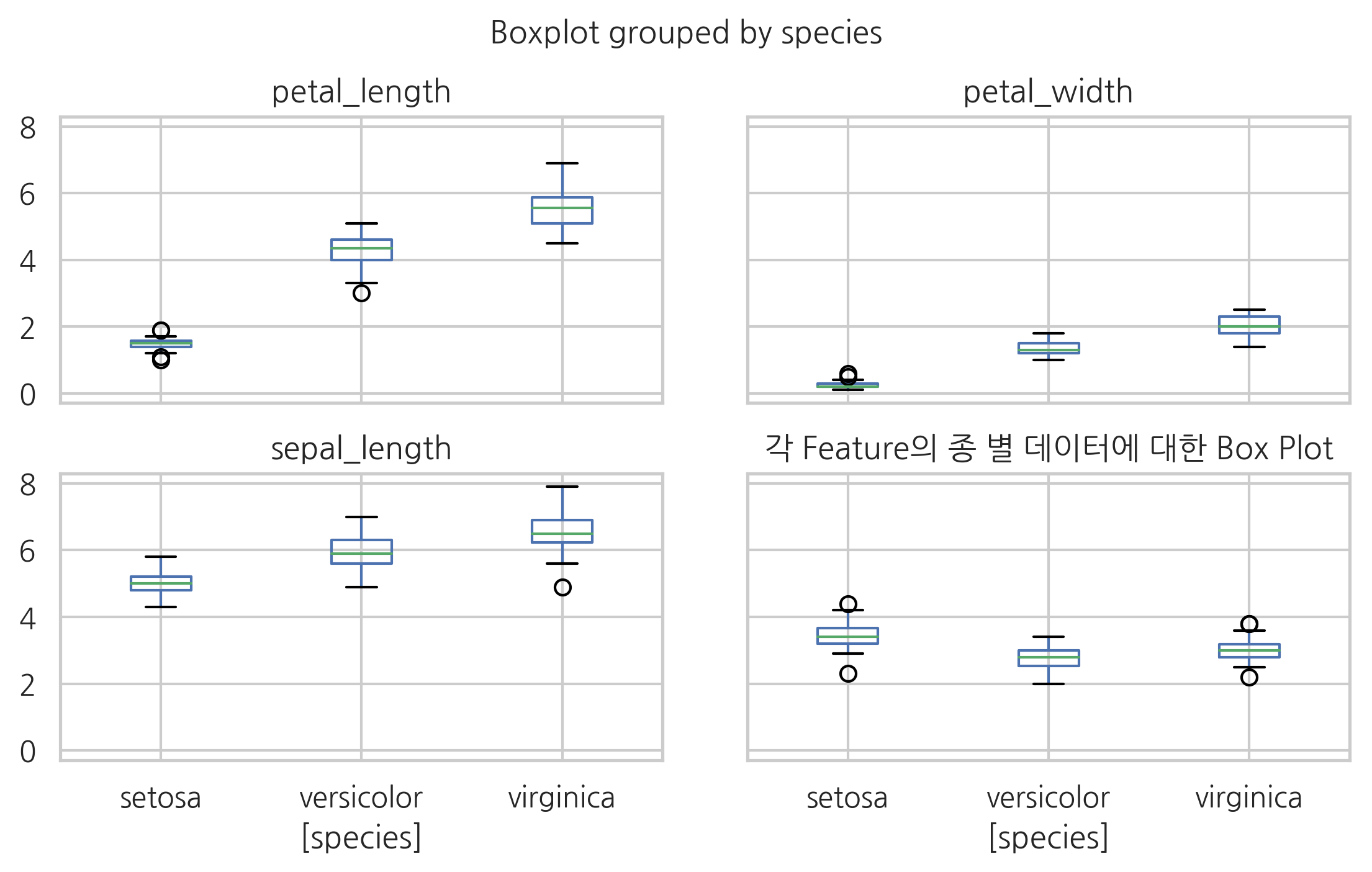
박스플롯에 대해서는 추가적인 기능을 가진 boxplot 명령이 별도로 있다.
iris.boxplot(by='species')
plt.tight_layout(pad=3, h_pad=1)
plt.title("각 Feature의 종 별 데이터에 대한 Box Plot")
plt.show()